I am obsessing about a few things. Paperback book covers from the 70s; the era I’m interested in is when paperbacks sold for 95 cents to a buck and a quarter.
That was the cost of about 3-5 cups of the bad coffee we drank back then. This coffee was 35 cents a cup at diners; and it was bottomless. All the bad coffee you could drink for a quarter and a dime. Sometimes they set the whole thermal carafe on your table. Knock yourself out. It was an automatic drip blend, I think, huge cans, that’s right, tin cans with no pull tops, of Folgers, Maxwell house, some combination of robusto and arabica, which was the secret of the old-timey affordability. Arabica costs more.
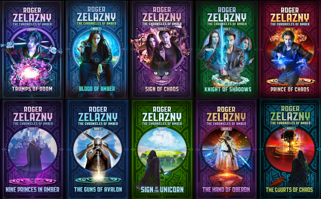
I’m looking at series novels, series I read growing up. Maybe not surprising, having recently, err, in the last few years, completed my cover design / illustration project for Roger Zelazny’s Nine Princes in Amber, and several other titles including Doorways in the Sand, Creatures of Light and Darkness, Dilvish the Damned, and the ongoing My Name is Legion project.
Maintaining the consistent brand on these was a challenge… it’s far from perfect, which, as it turns out, is sort of the norm in the series I’ve studied.
Anyway, I have been obsessing on creating a collection of the series books that really influenced me, each brand consistent, as my collection growing up, the fragments of which I still own, after many purges, were mongrel messes of covers, of eras, and of quality.
Some were used bookstore finds that fell apart as I read them, or as they sat on a shelf; some were new, for the time, with awful covers and bad typography, which became normal for SF books in the 70s and 80s, for reasons that I do not fully understand; computers hadn’t yet wrecked, or made tasteless, let’s say, a lot of design, so why they all became hideous before that era is mysterious.
So far I have identified Larry Niven’s known space, Heinlein’s signet years, Heinlein’s Ace Juveniles, the Pyramid E.E. Smith Collections (skylark and lensmen) and the Ballentine Lovecraft paperbacks as being iconic visually and important science fictionally. Hm. There’s also a set of foundation covers I am very attached to, and of course, that first legal LOTR where the covers form a triptych. Oh well.
I’m buying them all. I’ll do good scans and upload them to pinterest or whatever. Here too.

These are great, Jay. I’m enjoying the Lovecraft and Niven covers, but I’m especially interested in your Zelazny covers. However, the individual covers are quite tiny and hard to see. Any chance we can see some close to full size versions, of the Zelazny if nothing else? I realize there might be some licensing issues (whereas these thumbnails are arguable fair use), so if you can’t, you can’t.
If you can, I suggest you upload large, hi res versions somewhere and link from your blog. I think this project is the kind of thing that could get Boing Boing or someone interested.